
Google Sheets is a fantastic tool for keeping track of data, and for visualizing it as well. Graphs, Charts and more – thanks to Google’s free online program, it’s easier than ever. Or, at least, it should be.
Contents
Related Reading:
- Troubleshooting Google Sheets Not Working
- Why Won’t Google Sheets Let Me Type?
- How to Export All Google Sheets to Your Computer
- How to Hide and Unhide Rows and Columns in Google Sheets
Not every function is always apparent, especially for new users, so here are some tips on how to change the colors of your graphs and charts, and a few other tips that will help you make the most of your spreadsheets.
How to Change Graph Colors in Google Sheets
To change the color of your graphs in Google Sheets, you can follow these instructions.
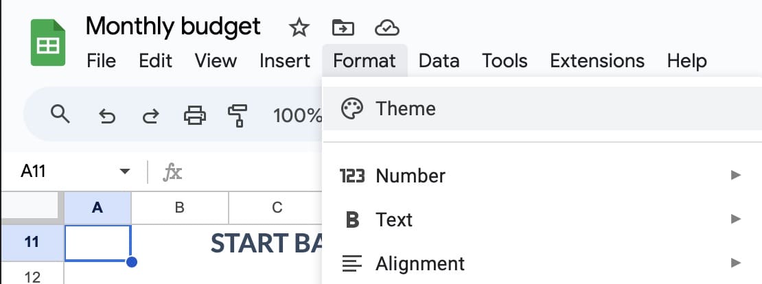
- Go to Format > Theme in the menu at the top of your screen.

- If you scroll down, you’ll see a list of preset color themes that you can use. Either select one of these or click on Customize.

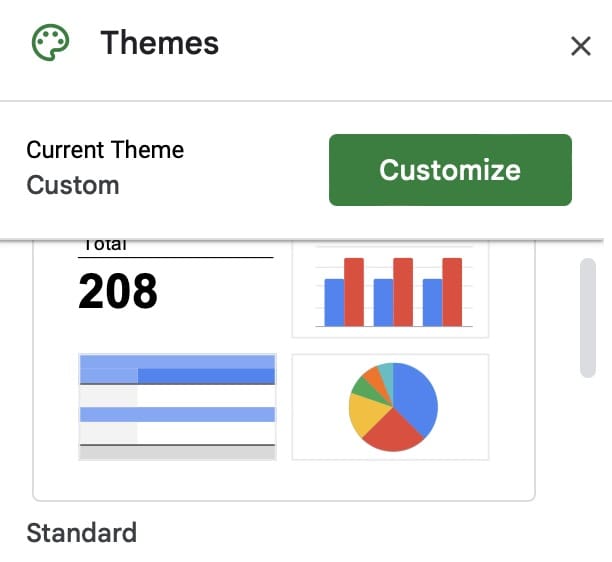
If you choose Customize, you’ll notice a broad selection of options for areas in which you can change your Google Sheets graph color. For example, you can adjust the background and text colors. Expand the dropdown menu next to each of these and pick the colors you want to change to.

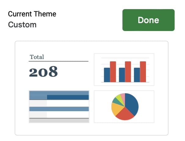
When you’re finished, tap Done.
How to Change Cell Colors in Your Graph on Google Sheets
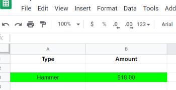
In addition to customizing your theme, you can adjust different sell colors. Doing so is quite simple, and it works in the same way as what you’d expect from filling in colors on any other Google Sheet.
After highlighting the cells you want to change, click on the Fill icon and choose the color you’d like to pick. After doing that, your changes should take immediate effect.

Use These Tips to Adjust Your Colors in Graphs on Google Sheets
When customizing your charts in Google Sheets, you’ve got a variety of options. You can pick from a number of presets, and it’s also possible to change specific graph colors. Note, however, that changing the background colors on these won’t alter any chart bars that are there.
Once you’ve altered the graph color adjustments to Google Sheets, check out our other Google Sheets guides to make the most out of the app.


The information missing in the article is to click the bar or line you want to change the color of, it will then pull up a menu you can edit.
Nope, this only addresses the background and font, not how to change the legend indicator color