
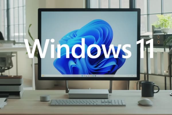
The first thing you notice after upgrading to Windows 11 is the new Start menu. That’s literally the very first thing you see on the screen after installing the OS. By default, the Start menu pops up in the center of the screen. But many users don’t really like the new UI design. Let’s see how you can bring the old Start menu back.
Contents
How Do I Restore the Old Start Menu in Windows 11?
Method 1: Use the Settings App
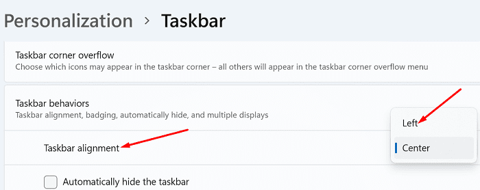
The quickest way to restore the old Start menu in Windows 11 is to edit your taskbar settings and align your taskbar to the left.
- Go to Settings
- Select Personalization
- Then click on Taskbar
- Scroll down to Taskbar behaviors
- Go to Taskbar alignment and select Left in the drop-down menu.

- Restart your computer to apply the changes.
Method 2: Tweak the Registry
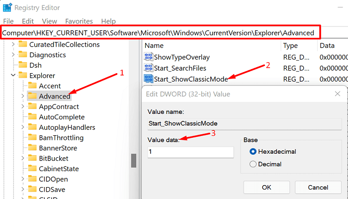
Another way to bring the old Start menu back is to use the Registry Editor.
- Click on the search button and type regedit.
- Double-click on the Registry Editor.
- Navigate to the following path:
HKEY_CURRENT_USER\Software\Microsoft\Windows\CurrentVersion\Explorer\Advanced - Then right-click on Advanced and select New → DWORD (32-bit) Value.
- Name the new value Start_ShowClassicMode.

- Double-click on Start_ShowClassicMode and set the value data to 1.
- Restart your computer and check if the Start menu is aligned to the left now.
Customize Your Start Menu
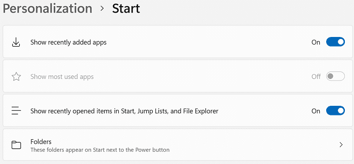
The list of options doesn’t end here; you can further customize your Start menu. For example, you can select what items you want to see on the menu.
Go to Settings → Personalization → Start. You can choose to show recently opened apps, as well as Jump Lists and items that you recently opened in File Explorer. You can also select which folders appear next to the Power button.
Conclusion
If you want to move the Windows 11 start menu to the left, you can go to Taskbar settings and select the left taskbar alignment option. Alternatively, you can also tweak your Registry to get the job done. What do you think about the new Windows 11 start menu? Love it or hate it? Share your thoughts in the comments below.

It’s not just the start menu that Microsoft screwed up.
They also screwed up the explorer context menu, and the entire settings menu system.
Now you need to go three levels deep to change a setting.
When I setup a new pc for a user. There are over 100 adjustments I make.
Most have to do with privacy and security options, but it now takes me almost an hour to do what used to take about 15 minutes in windows 10.
At this point, I just don’t understand why Microsoft thinks they need to try to hide settings by burying them deeper in menus. Then after changing the one setting, you can’t just go back to the previous menu level, you get put back at the top level menu and have to drill down two or three levels to get to the next setting.
I done trying to defend Microsoft.
They need to start fixing problems instead of just changing the user interface.
Funny how this article was published later than the Windows version this “fix” stopped working on. At this point, you are not just copying others, you are copying the WRONG info from them.
Just accidentally installed it on one machine. Looks a lot like the menu for the Chromebook.
Really?
I still remember them tooling around with the old buttons on Office. After customizing my buttons (including drawing my own tags for some of them and making ANOTHER toolbar to allow people to use their own personal ones…), they changed it.
Eventually I learned how to find what I wanted. And they changed it again (with automatically size adjusting menus and moving things around based on my usage.
STOP IT.
Now this.
The one thing they should be able to easily do is make it so the same basic finctions can be mapped to a SIMILAR interface if chosen. SOME things would need to be adjusted, but keep the base.
Microsoft is just like many other software – once you finally get used to using something, they up and change it, usually hiding the things you use most in a different location. Personally I think the software techies don’t have enough to do and need to justify their jobs by finding something to change! I see similar stuff in software upgrades I’ve used at work. After how many years, I still hate that “ribbon” in Microsoft Office. I had to use the newest versions at work (just retired) and spent way too much time hunting for features I wanted to use, but I still use Office 2003 at home (all I use is Word and Excel)! Good enough for me and I know exactly where to find everything I want. Also PhotoDraw from Office 2000 … best photo editing software I ever used. Just because it’s old (like me) doesn’t mean it doesn’t still work.
I put off so-called ‘upgrading’ to win11 because I feared what might happen. Yesterday I upgraded and my fears were well founded. Why oh why does MS do it? Are they really so out of touch with their users?
Hating the new Start Menu design. Microsoft falls short to listen to the needs of all its customers and users, and deliver a start menu interface that allows customers to choose to use the new design or provide option to revert to previous Windows 10, or even a Windows 7 start menu interface.. The old start menu from WIndows 95 when introduced was user friendly and continued into Windows 7, When introduced to a new start menu design for Windows 8, customers and users complained and Windows 10 returned to a provide option of the start menu design that was stylized back to the basic conceptual design of Windows 7. Windows 10 improvements were to introduce tiles, but that was still lame, but at least it had the previous flare of previous Windows 7 start menu. Now the WIndows 11 start menu has been designed in the wrong direction.
Please give us option to roll back or use the start menu of Windows 10 or 7.
I*m hating Windows 11! Apparently Microsoft have nil understanding of working in the real world with multiple languages but a touch-typist who uses the keyboard in their own lanuage. Not being able to fix the taskbar to the left hand side of the screen (where it does not restrict the depth of page visible) is a definite step back into the dark ages. Right click and what happens? Where is the rename, copy, save as and all the rest? Tiny little icons mixed in with commands in dropdown boxes is such bad news for people in low light/poor eyesight. It I want Android features I use my phone, not my laptop or PC! Come on MS! You need to up the ante very quickly, otherwise I’m off to the opposition. Seriously, this time… :(
microsoft ever the losers… never listen, never fix, just obscure, hide and fail.
microsofts default action has always been failure… and always will be.
Having been a developer for over 40 years I have to say that Windows 11 is the most disrespectful upgrade I have ever seen!
Lets get back to making our code BETTER not just move things around and changing work flows that havde been used for years. What happend to user friendly?
Windows 11 sucks!!!
Its Crap, why change something that works beautifully for the sake of change, the developers need to put their efforts into improving things not just changing them.
Doesn’t work
Microsoft philosophy –
If it ain’t broke, ……… break it!
I didn’t think I would ever have to say this 90s meme again, but “Windows must die.” And their developers literally, and they will go directly to the Hell’s pan. Without the choice as an available feature.
Look up an application called start 11, it’ll add start menu styles for you going back to Windows 7 if you like.
Why must you redefine the UI every time you update windows. Just leave it alone and let people explore if they want to.
While it is not as horrible as the Widows 8 menu system, it appears the Microsoft didn’t really learn from that disaster. To say what I think of the Windows 11 start men, I would have to swear, and I won’t do that.
Why does it have to take up so much screen space. Just useless grandstanding by Microsoft’s software designers.
The new start menu is RIDICULOUS. Again, MS removes something functional that we all know how to use and replaces it with some half-baked idea and we, the end-users are just supposed to take it.
I tried your easy fix for the menu, but, of course, it doesn’t work. Is there a separated “fix” for 64 bit machines?
I really despise Apple and it’s whole business model, but with every one of the bad ideas, you make me look harder at Apple products and justify to myself why I don’t just move over to their environment. Especially now that it works so much like windows anyway.
Are MS developers absolutely tone-deaf? With every update they replace some really useful feature (e.g., the flexibility of organizing the Windows 10 Start Menu) with some abomination (e.g., the Windows 11 start menu) and provide no mechanism for falling back to a feature that many users find very helpful (in this case, in organizing workflow). I think there must be a “change-for-change’s-sake” mentality by a bunch of developers who don’t understand their product as well as many users do. This is true of changes to MS Office products as well.
My new computer came with Windows 11 pre-installed, but I’m sticking with Windows 10 on my older workhorse computer.
Boooooooooo.
Microsoft once again proves that they don’t care about their end-users at all and they will force their s***** software down your throat no matter what. Screw you Microsoft.
Like so many others, I really hate that Windows 11 new start menu. Why in this wold MS IU development department removed a perfectly functional menu system.
Easy to do tweak. Not working. Unfortunately…
why did microsoft go changing things around and not even give an option to use old features? so frustrating when companies do that. i am not impressed with windows 11. i am sorry i let me computer upgrade now
Hate Win11 Start menu trying to become a mac menu. I want it at the TOP. Fk Microsoft developers – where is the choice??
I feel like a terrible whiner, but can’t see any improvement in what they’ve done to my start bar.
I set the start bar back on the left and still hate it.
I want to have some options:
* Put the widgets or active icons for the weather and calendar along with the other apps, and
* let me rearrange their sizes and group the most often used apps for my own convenience.
* I would like for everything I use often to be visible at once, without scrolling down, or having to remember where it is.
The Windows 11 start menu makes me want to reverse to win 10, Which idiot in UI design decided to remove almost all useful functionality from app selection, grouping and ease of setting up your most used apps without having to “search” or scroll through (the bloated add-on, mostly useless software) in you apps list. I’m a developer and it has significantly degraded my performance in this respect. Regardless of anything else in Win 11 this is enough to make it a disastrous upgrade. It’s not even simplified, just takes longer to use than the Win 10 version with no benefit.
I hate Windows 11 new start menu!
Yup – sadly this is no go in RTM
New start menu is fine for MOST users – although the old one was better. Much better. But if you only use 10 apps or so, its useable.
For me – with dozens of Dev and system management tools, it is terrible
Also – for my creative computer (photo, video, illustration, Fusion etc etc) there are so many apps it is almost unworkable
I have decided – for now – to create folders on the desktop and then pin them to the start menu – I’ll make a custom icon file to I can change the visual (without using the shell32.dll set)
One thing I really liked MS Mobile OS was the start menu – I mention that because THIS new start menu reminds me of the Android/iOS style
The various sized tiles – active tiles of not – various colours – folders etc – allowed me to organize everything with excellent visual cues. With the bland homogeneous layouts of Android and iOS it takes a second to position yourself within your menu pages…. The MS Start menu allowed me to group more easily – everything (mostly) on the one screen – and the visual variance made access faster….
I suspect it won’t be long for a solution to appear – the Windows 8/10 menus annoyed some at first, but since the start button came into existence on 95, there hasn’t been a better system… and that itself was an improvement over the folder based methods of 2.x plus….and 1.0 of course :-)
Not being able to move the taskbar to the left side of the screen is a big inconvenience plus they force groupings like word documents. I can have 20 word documents open at once and now they are grouped as one on the bottom of the screen and it has dramatically increased my editing time. Thanks for nothing Microsoft.
yes, but how can i restore the groups feature (like folders) on my start menu (I like to organize my shortcuts based on functionality)
Please let me know how I can return to the Win 11 star menu.
I followed your instructions but after deleting Start_ShowClassicMode teh old menu is still there.
Not one tiny scrap of this fixes what I want. It doesn’t even address it.
Aligning the taskbar to the left was easy. What I want is Windows 10 FUNCTIONALITY.
– I want to remove the Recommended section completely.
– I want to be able to organize my pinned programs into groups
– I want to have my programs NOT IN FOLDERS on the All apps menu; I want to be able to see their icons
Basically, I want that Start menu to 100% work EXACTLY like Windows 8.1 and/or 10. THAT’S what I want, because THAT was user-friendly.
Hate Windows 11 new start menu
This feature has been removed from Win 11 RTM and method above no longer works
The Regedit tweak is not working.